Designing meaningful digital experiences
from concept to code.
I'm a Frontend Developer & UX/UI Designer studying at Nackademin.
With a background in architecture and visual design, I create clean,
user-centered interfaces and build them with modern frontend tools.
Based in Stockholm, creating calm digital experiences through
UX/UI and frontend craft.
FigmaHTML/CSSJavaScriptReact
Projects
Selected projects from concept and structure to responsive
implementation.
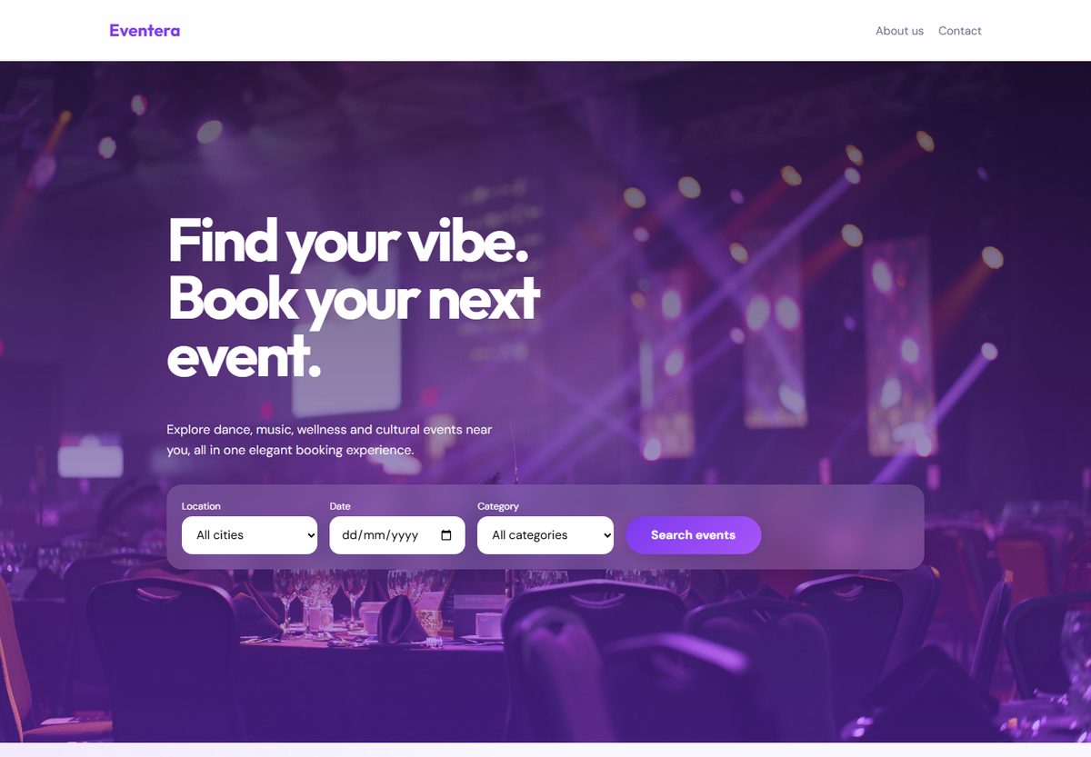
Fullstack / Event Booking
Eventera Webshop
Eventera is a modern event discovery and booking platform built
as a collaborative frontend/backend project. Users can browse
events, view event details, and reserve spots through an
interactive booking flow connected to a live API.
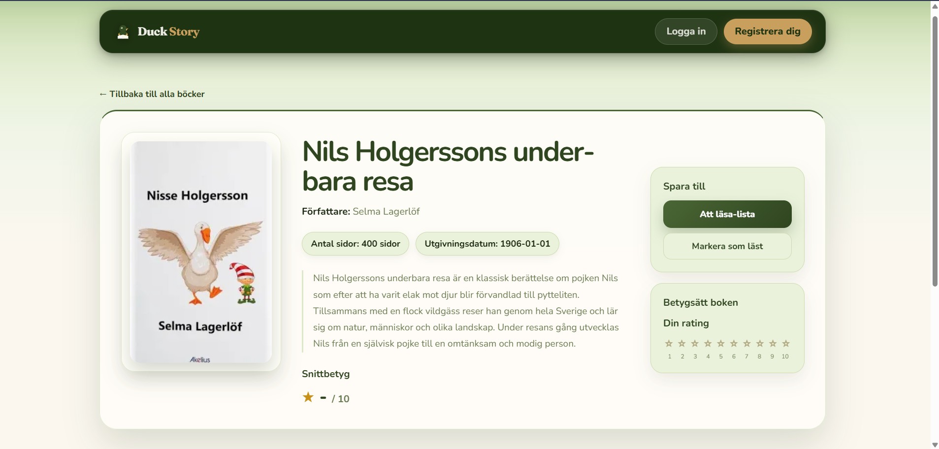
Duck Story is a children's book discovery app built for parents.
Users can browse books, save titles to a personal reading list,
mark books as read, and rate them 1–10 — all connected to a
headless CMS with user authentication
Users feel overwhelmed when choosing design services. The site
needed clearer services, stronger trust signals, and a simple
path to contact.
Process
User intent: Identify urgency and questions
before booking.
Information hierarchy: Services → proof →
CTA, in that order.
Iteration: Wireframes → UI → small copy
improvements.
Solution
TrustExperience + testimonials + portfolio proof
ClarityClear services with short benefits
ConversionStrong CTA: “Book a consultation”
Frida Studio
Design Artifacts
01 / Persona
Our Clients
Homeowners seeking professional design help to
increase property value
Sarah Nielsen
Homeowner, 42 years old
Demographics
Age: 30-60
Urban homeowner
Not a design expert
Values professional guidance
Context
Preparing to sell home
Emotionally stressed
Limited design knowledge
Seeking trustworthy experts
Goals
Sell house faster
Increase property value
Redesign outdated kitchen
Prepare rental property
Needs
Clear service offerings
Proof of expertise
Before/after examples
Easy booking process
“I want my home to look modern and appealing to
buyers, but I don't know where to start. I need
someone I can trust who has done this before.”
02 / Client Journey
Client Journey
Mapping the emotional path from uncertainty to
confidence.
This artifact highlights how the client moves
through different stages: recognizing a need,
searching for help, comparing options, building
trust, and finally feeling ready to make contact.
It helped define where the website should reassure,
inform, and guide the user toward booking a
consultation.
01
Problem awareness Stressed
02
Search Uncertain
03
Discovery Curious
04
Exploration Interested
05
Trust Building Confident
06
Action Motivated
07
Resolution Satisfied
Our approach: build trust through portfolio examples
and make consultation booking simple and safe.
03 / Storyboard
Storyboard
Visualizing the user's real-life situation and
motivations.
The storyboard translates the service into a human
scenario. It shows how a homeowner feels before,
during, and after discovering Frida Studio.
This made it easier to design a website that feels
relevant, clear, and emotionally connected to the
user's needs.
1
The Problem Frustrated & Worried
2
Searching for Help Hopeful
3
First Impression Impressed
4
Exploring Services Interested
5
Taking Action Confident
6
The Result Satisfied & Relieved
04 / Site Structure
Site Structure
Creating a clear information hierarchy for better
navigation.
The site structure defines how content is organized
across the website, helping users quickly understand
services, trust signals, and the path to contact.
It ensures that the experience feels intuitive and
that important content appears in the right order.
Root
Home anchors the full experience.
Main Pages
About, Services, Portfolio, Process, Contact.
Priority
Services and portfolio are surfaced early.
CTA Focus
Contact remains accessible from every page.
05 / Responsive Design
Responsive Design
Adapting the experience for different devices and
screen sizes.
This artifact explores how the layout shifts between
desktop and mobile while keeping the visual balance,
readability, and CTA clarity.
The goal was to preserve a premium and calm feeling
across all devices.
Single-column flow, larger tap targets, focused
CTA.
06 / Design System
Design System
Establishing a consistent visual language across the
project.
The design system includes colors, typography,
spacing, and reusable interface rules.
It helped keep the brand expression elegant,
cohesive, and easy to scale through the different
sections of the website.
Palette
Warm white, soft beige, muted green, charcoal.
Typography
Elegant serif paired with a clean sans-serif.
Feeling
Calm, refined, welcoming, and easy to trust.
07 / UI Component
UI Component
Defining reusable interface pieces for a polished
user experience.
This artifact focuses on the smaller building blocks
of the interface, such as buttons, cards, labels,
and layout elements.
Reusable components strengthen consistency and make
the final design feel more professional and
deliberate.
Buttons
Primary, secondary, and text actions with clear
hierarchy.
Card Styles
Simple presentation blocks for projects and
service content.
Spacing System
Consistent small-to-large spacing rhythm across
the UI.
Result & Learnings
The site communicates value faster and guides users to contact
with less friction. Biggest learning: clear hierarchy + proof
beats long text.
About
I turn ideas into intuitive digital experiences—blending design
thinking, frontend skills, and a passion for clarity and visual
harmony.
My architecture background gives me a strong sense of structure,
layout, and user flow. I enjoy building interfaces that feel
simple, intentional, and accessible.